Signs 101: Sign Design and Placement
You’ve learned about the why and how of signs, what type of sign could be best for your business, and how best to light your signs. Now, it’s time for possibly the most important part of your signage: your sign design and placement. A poorly designed sign will never bring in foot traffic even if it’s on a beautiful monument. The brightest spotlight on the market can’t save a sign that’s blocked by a tree. But if you’re reading this, it’s not too late. We’re here to give you the guidelines you need to design your business an attractive, readable sign. And don’t worry–if this all is too overwhelming, remember that MRCsigns’ graphic design team has you covered.
Sign Design
Signage design uses the same basic principles of design as anything else, but with some exceptions. Because signs are designed to be viewed from a distance, signs have to be clear and readable first and foremost. The most important factors that affect your sign design’s readability are its colors, text, and complexity.
Sign Colors
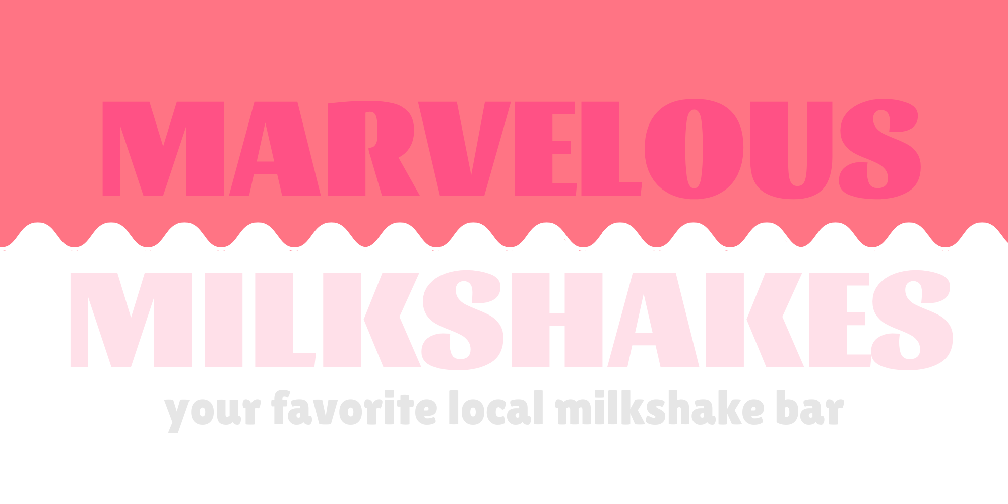
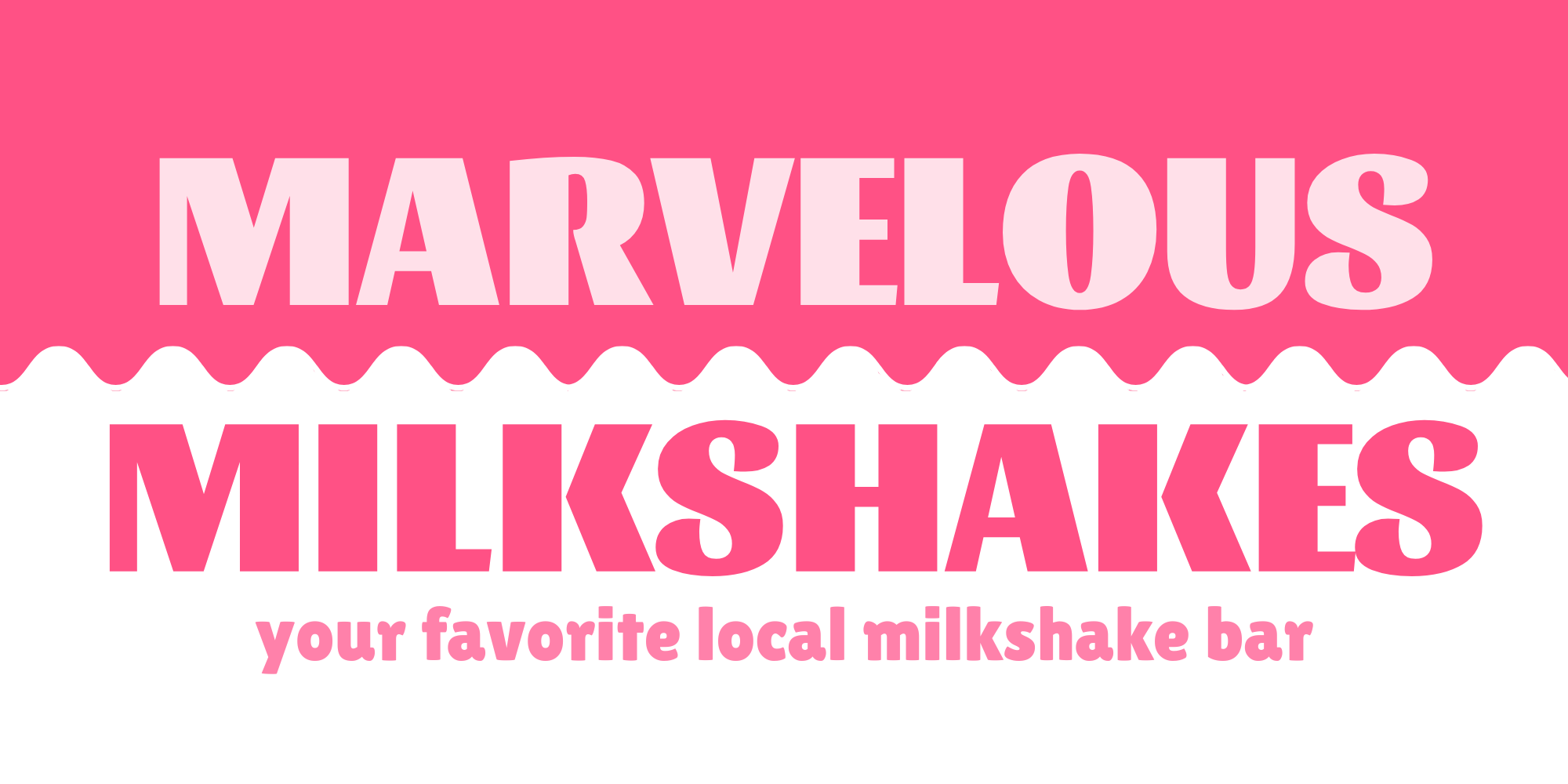
Your brand probably has its own colors, especially if you already have a logo. How you apply these colors on the sign, however, can make or break your signage’s design. High contrast colors, such as black and white, make signs more readable when used sparingly. Low contrast colors, such as blue and green, can muddy the design of your sign. Easy rules of thumb when designing your sign include making sure you don’t put light colors on top of light colors or dark colors on top of dark colors, as well as making sure you don’t add too many colors. For example, which of the below signs has a more readable color scheme?
Sign Text
The text of your sign is crucial. Without it, how will customers know what you’re advertising, what your business’s name is, or what you do? At the same time, however, it’s important to make sure you don’t include too much. No one can read an entire paragraph while speeding down Main Street at 45 mph. The most important text on your sign also needs to be big enough to read at a distance, and quickly.
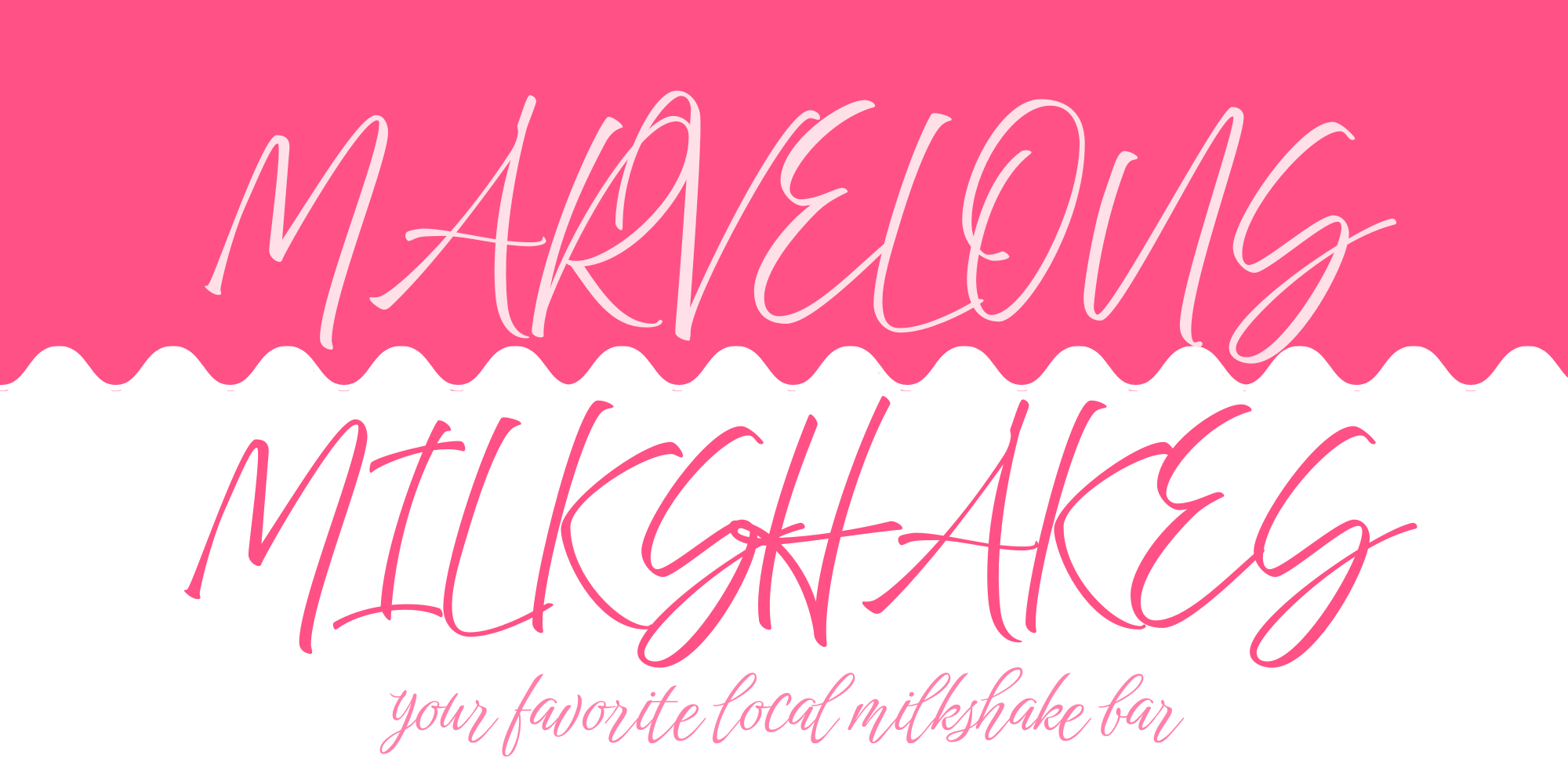
The font you use also matters. Calligraphy or script fonts look beautiful and may suit your business very well, but they are harder to read. Studies have shown that script- or handwriting-style fonts can be more than three times less legible than standard, non-script fonts. Consider putting information on your sign in clear, large font. After all, which of the below signs would you be more likely to read on your commute home?

Sign Complexity
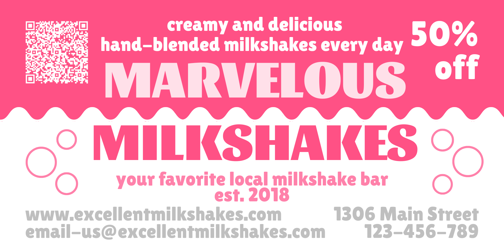
Much like simpler fonts make your sign more readable, simpler designs make your sign more readable, too. Though you may be tempted to add your logo and your business name and your tagline and the services you offer and your latest sale and a QR code to your website and a picture of your dog, don’t. Too many elements in your signage will reduce it to background noise in your customer’s eyes. Instead, focus on the most important elements, and make sure each element has enough room on your sign.

These graphic design principles can get your signage design from mediocre to eye-catching. But if it’s still an intimidating concept or if you just don’t have time, MRCsigns has you covered. Our graphic design team can take your existing brand and design you an eye-catching sign to suit your business’s needs. Reach out to our sales team now to get a quote for your signage design.
Sign Placement
Where you place your signage is the most important factor of all. Good signage can make your business eye-catching for potential customers, make your business easier to find for new customers, and reduce friction for existing customers–but only if it’s visible.
It’s important to consider the size of your sign when deciding where to put it. A small banner may be effective above your business’s entrance, but it won’t be nearly as effective by the side of the road. Similarly, a sign placed perpendicular to the road is relatively easy to read, but the same design placed parallel to the road may need to be up to 70% larger in order to be read in time.
If you want passing drivers to be able to locate your business, it’s important that your signage be visible from the road, and from far enough down the road that it can be read before the driver passes it. Signs need to be large enough to read and large enough to be eye-catching. These signs can take the form of your business’s own monument or pylon sign or a multi-tenant sign arranged by a landlord for all the businesses in your complex. Additionally, you’ve got to make sure your signage isn’t blocked by any landscaping, architecture, or other obstacles.
Don’t forget, local ordinances may have restrictions around where you can place your business’s signage. But you don’t need to make big signage decisions or wade through legal jargon by yourself. MRCsigns’s signage and permitting experts can make sure your sign is placed in the most optimal location with no fuss.
Now It’s Your Turn
Now that you’ve read all of our Signs 101 series, you’re ready to plan the perfect signage for your business. Need a refresher? Missed our previous installments? Check out why your business needs a sign, all the different types of signs, and the details of signage lighting on our previous blogs.
If you want a useful guide for choosing the best signage for you, we’ve got a cheat sheet to make choosing your signage as easy as M-R-C. Enter your email below to gain access to our signage cheat sheet and other future offers!
Once you’ve finished your cheat sheet and know exactly what type of sign you want, be sure to contact us for a quote for your signage project!
