Doylestown is one of the best places in Bucks County to run a storefront business. It’s also one of the places where getting a sign right takes a little extra care. Between the historic district downtown and the busy commercial corridors around it, a Doylestown sign has to look good, follow local rules, and hold up to Pennsylvania weather year after year.
MRC Signs is based just up the road at 704 Dublin Pike in Dublin, so Doylestown is part of our home turf. Here’s how we help local businesses with new signs, repairs, and everything in between.
Sign Installation for Doylestown Businesses
We install the full range of exterior business signs:
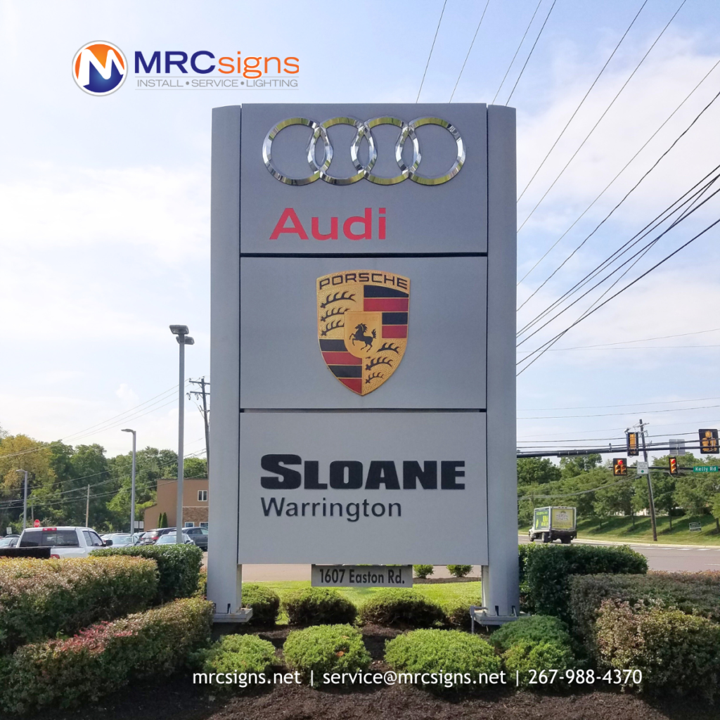
Monument and pylon signs, including the foundation work
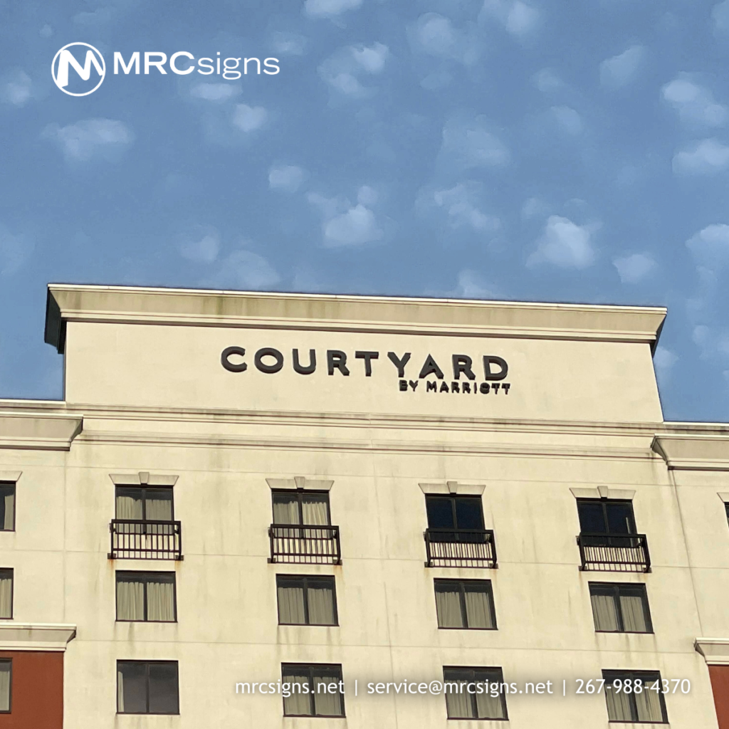
Building and wall signs for offices, medical buildings, and retail centers
Electrical work for signs, so the sign is wired and working when we leave
We run three crews and a 65-foot crane/bucket truck, so we can handle anything from a small shop sign on State Street to a tall pylon along a main road. Most installations take 1 to 3 days on site, and turnaround is usually about a week once everything is approved and ready.
Signs in the Doylestown Historic District
If your business is in downtown Doylestown, there’s a good chance it sits inside the Borough’s designated Historic District. That changes the process.
According to the Borough of Doylestown, its Historical and Architectural Review Board (HARB) reviews exterior building changes, and that includes signs, within the Historic District. New or changed signs there need a Certificate of Appropriateness before the Borough processes the sign permit. The Borough asks applicants to submit the sign permit application along with the HARB application. A typical package includes:
Photos of the building, showing any existing signs and where the new sign will go
Scale drawings showing the sign’s size, shape, location, and how it will be attached
Building frontage measurements and sign clearances
The sign’s content, letter style, and logos
Color and material samples
A description of any lighting
HARB meets monthly, and applications have to be in ahead of the meeting. The Borough’s website lists the current deadlines and meeting dates. The applicant needs to attend the meeting for the application to be reviewed. Plan for that time. If you want a new sign up for a grand opening, start the conversation early.
One more thing worth knowing: not every “Doylestown” address is in the Borough. Many businesses with a Doylestown mailing address are actually in Doylestown Township or a neighboring township, and each municipality has its own sign rules. We always check which one applies before anything gets ordered.
Site Surveys and Permit Help
Paperwork is where a lot of sign projects stall. We offer site surveys and permit help. We’ll look at the building, take measurements, check the electrical situation, and help pull together the drawings and details your municipality asks for. We can’t promise how fast a township or borough will approve something, but we can help make sure the application is complete the first time.
Sign Service and Repair
Signs break. Letters go dark, transformers fail, timers get knocked out of sync, and storms do damage. We service and repair existing signs, whether or not we installed them. That includes:
Troubleshooting lighting and electrical problems
Replacing failed components
Fixing storm or impact damage
Getting dark letters or cabinets lit again
A dark sign at night tells customers you might be closed. Getting it fixed quickly matters, and having a local crew nearby helps.
LED Retrofits for Older Signs
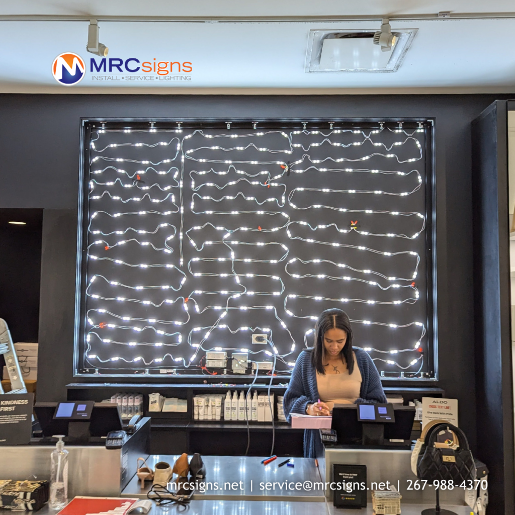
Many signs around Doylestown still run on older fluorescent tubes or neon. An LED retrofit swaps the old lighting for LED modules inside your existing sign. You keep the sign you have, and it usually gets brighter and more even, uses less power, and needs less maintenance. If your sign looks dim, patchy, or flickers, a retrofit is often a better first step than replacing the whole thing.
Sign Removals
Moving, rebranding, or closing a location? We handle sign removals, including taking down channel letters and cabinets and disconnecting the electrical safely. We can also coordinate with a new install if you’re swapping one sign for another.
Talk to a Local Sign Company
If you need a new sign, a repair, or just want to know what your municipality will allow, give us a call. We work all over Doylestown and the rest of Central Bucks, and throughout Pennsylvania, New Jersey, and Delaware.
It’s every business owner’s nightmare scenario: you know your business needs a sign. You’ve created the perfect sign design. But when you see the final product, the colors are all wrong, and your sign’s graphics are pixelated, blurry, or both. What happened?
Preparing your graphics for printing, especially large-scale printing such as sign graphics, can require a lot of knowledge and familiarity with graphic design and file specs. MRCsigns’ graphic design and printing prep team is ready to help you prepare your sign’s graphics for printing, but if you’re prepping files yourself, here’s what you should know before sending any file to print.
Raster vs. Vector Sign Graphics
Your sign’s graphics can be rendered as either raster or vector. In raster images, hundreds of thousands of tiny dots of color–pixels–are placed on a grid to create your image. Vector images, however, rely on mathematical formulas to calculate the shapes and lines that make up your graphics. Because the placement of the pixels is determined by formulas, your sign’s graphics can be made any size and still look sharp. If you are making your image larger, the formulas will determine where to place new pixels. If you are making it smaller, the formulas will determine where to remove them. With raster graphics, however, the existing pixels either compress or stretch. This means the jagged, pixelated edges become more obvious as your sign’s graphics are scaled up. For this reason, it’s best if the graphics you intend for your sign are in vector format from the start.
Certain programs are specifically designed for vectors. When creating your sign graphics, consider working in Adobe Illustrator, CorelDraw, or Inkscape instead of Adobe Photoshop, Canva, or Microsoft Paint.
File Types
The file type you use for your sign’s graphics can also play a part in the pixelation and blurriness of your sign. Certain types of files do not hold vector graphics, only raster; others are the opposite. Some can even hold both.
Some of the types of file that can hold vector images are .pdfs, .ai, .svg and .eps. File types that hold raster include .jpg, .bmp, .gif, .png, and .tif. However, just because a file type can hold a vector image doesn’t mean it does. Make sure that when you are creating the graphics for your sign, you’re using vector tools from the start, not just converting to an .ai file at the end and expecting your graphic to suddenly become a vector.
DPI and PPI
Vector graphics are usually preferable for signage. Raster images, however, do have their uses. For example, you may want to include photography in your signage. Photos are far too complicated to be stored as vector images. Instead, the ideal form for photography is a high-resolution raster image. Resolution of images meant for screens is referred to as “PPI,” or pixels per inch. When printing, resolution is measured in DPI, or dots per inch. This refers to the literal amount of dots of colored ink the printer is told to add per every inch of your design.
Many factors influence the ideal DPI of your sign graphics. If a sign is very large and intended to be viewed at a distance, lower DPI may be acceptable. After all, the human eye can only capture so much detail from fifty feet away. However, don’t make an assumption that your low res photo is a-okay. Higher res is always easier to work with, because making an image smaller is easier than making it larger.
Smaller signs meant to be viewed further away should be printed at 300 DPI. In fact, 300 DPI is a good rule of thumb when working with any file meant to be printed.
Design to Scale
Before you design the graphics for your sign, you should know how large your sign is going to be. When you create your file, be sure your canvas or artboard fits the dimensions of your future sign. This can help avoid any nasty, pixelated surprises when you go to get your sign graphics printed.
Some sign’s dimensions may exceed the limits of your vector program’s artboard or canvas sizes. In this case, many printers recommend you create your graphics at a smaller scale. Try 75%, 50%, or 25%–but not lower, as past this size, you may once again begin to encounter issues with quality.
Raster based image programs also have size limits. Changing your canvas size still works, but you have to increase your DPI accordingly. For example, you can reduce your file size from 8’ x 10’ to 4’ x 5’, a reduction of 50%, but you would need to increase the DPI by 50%, too; for example, from 300 DPI to 450 DPI.
If your graphics were created at a small size or low resolution, it can be nearly impossible to scale them up to the size of a sign after the fact. Sometimes, the only way forward is to remake the entire design. Start with a large, high resolution file so your hard work and graphics aren’t wasted.
CMYK vs RGB
You may have heard the acronyms “CMYK” or “RGB.” These describe the way various devices interpret the colors in your graphics, referred to as color profiles.
Most files on the internet are in RGB, as they are optimized for screens. Screens display color through light. If you’ve ever shone a light through a prism and seen a rainbow come out the other side, you know white light is actually a combination of all colors of light. Screens work by displaying varying amounts of red (R), green (G), and blue (B) light. High amounts of red, green, and blue light mix to create white. Low amounts create black.
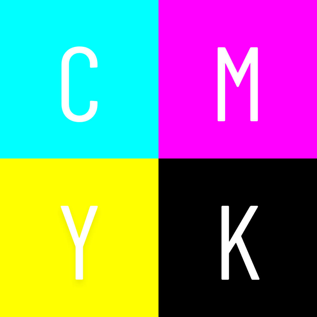
Print files, on the other hand, use CMYK. Ink shows color in the opposite way light does; combining three standard ink colors; cyan (C), magenta (M), yellow (Y); creates black (K). Adding no ink leaves white.
RGB color profiles can be converted to CMYK color profiles, but the conversion process isn’t one to one. While not a sign-destroying error, the colors of your sign’s graphics may not come out exactly like you imagined. The options to change color profiles are available when you create a new file in your program of choice. If you plan to print, be sure your sign graphics are in CMYK from the start, not RGB.
Printers interpret images as CMYK.
Screens interpret images as RGB.
Trust the Sign Graphics Pros
These basic tips should help you optimize your sign graphics for printing. However, every sign project is unique, and not everything can be accounted for in a basic guide. Some things can only be learned through years of experience, and some techniques are specific to the signage industry. That’s where MRCsigns’ design team steps in. Our team preps your sign designs and graphics for print. We also install and maintain your signage. Reach out to our sign designers today to get a quote for your signage design, printing, and installation!
If you want to stay in the loop with more signage tips and what MRCsigns has to offer, sign up for our biweekly newsletter or connect with us on social media.
You’ve learned about the why and how of signs, what type of sign could be best for your business, and how best to light your signs. Now, it’s time for possibly the most important part of your signage: your sign design and placement. A poorly designed sign will never bring in foot traffic even if it’s on a beautiful monument. The brightest spotlight on the market can’t save a sign that’s blocked by a tree. But if you’re reading this, it’s not too late. We’re here to give you the guidelines you need to design your business an attractive, readable sign. And don’t worry–if this all is too overwhelming, remember that MRCsigns’ graphic design team has you covered.
Sign Design
Signage design uses the same basic principles of design as anything else, but with some exceptions. Because signs are designed to be viewed from a distance, signs have to be clear and readable first and foremost. The most important factors that affect your sign design’s readability are its colors, text, and complexity.
Sign Colors
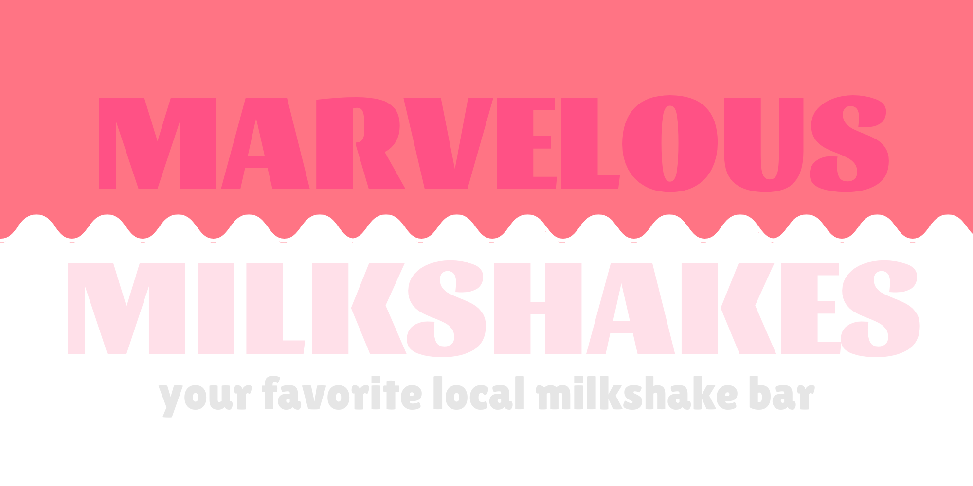
Your brand probably has its own colors, especially if you already have a logo. How you apply these colors on the sign, however, can make or break your signage’s design. High contrast colors, such as black and white, make signs more readable when used sparingly. Low contrast colors, such as blue and green, can muddy the design of your sign. Easy rules of thumb when designing your sign include making sure you don’t put light colors on top of light colors or dark colors on top of dark colors, as well as making sure you don’t add too many colors. For example, which of the below signs has a more readable color scheme?
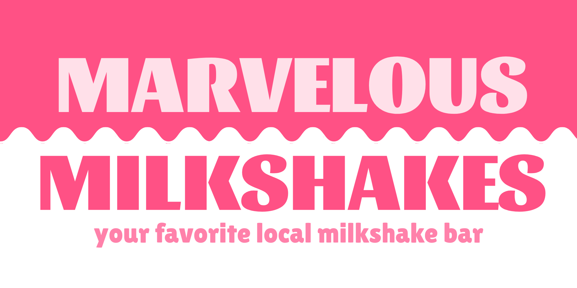
The design of this sign features low-contrast, hard-to-read colors.
The design of this sign uses high-contrast, readable colors.
Sign Text
The text of your sign is crucial. Without it, how will customers know what you’re advertising, what your business’s name is, or what you do? At the same time, however, it’s important to make sure you don’t include too much. No one can read an entire paragraph while speeding down Main Street at 45 mph. The most important text on your sign also needs to be big enough to read at a distance, and quickly.
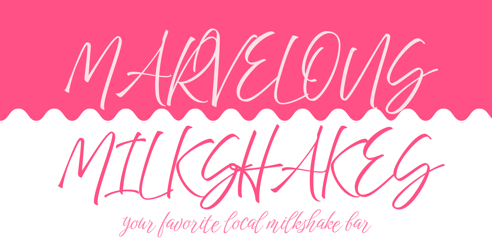
The font you use also matters. Calligraphy or script fonts look beautiful and may suit your business very well, but they are harder to read. Studies have shown that script- or handwriting-style fonts can be more than three times less legible than standard, non-script fonts. Consider putting information on your sign in clear, large font. After all, which of the below signs would you be more likely to read on your commute home?
The design of this sign features hard to read script-style fonts.
The design of this sign uses high-contrast, readable colors.
Sign Complexity
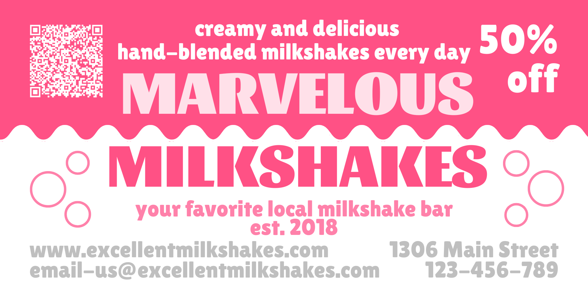
Much like simpler fonts make your sign more readable, simpler designs make your sign more readable, too. Though you may be tempted to add your logo and your business name and your tagline and the services you offer and your latest sale and a QR code to your website and a picture of your dog, don’t. Too many elements in your signage will reduce it to background noise in your customer’s eyes. Instead, focus on the most important elements, and make sure each element has enough room on your sign.
The design of this sign is too crowded and busy to be legible.
The design of this sign features a simple, easily readable layout.
These graphic design principles can get your signage design from mediocre to eye-catching. But if it’s still an intimidating concept or if you just don’t have time, MRCsigns has you covered. Our graphic design team can take your existing brand and design you an eye-catching sign to suit your business’s needs. Reach out to our sales team now to get a quote for your signage design.
Sign Placement
Where you place your signage is the most important factor of all. Good signage can make your business eye-catching for potential customers, make your business easier to find for new customers, and reduce friction for existing customers–but only if it’s visible.
It’s important to consider the size of your sign when deciding where to put it. A small banner may be effective above your business’s entrance, but it won’t be nearly as effective by the side of the road. Similarly, a sign placed perpendicular to the road is relatively easy to read, but the same design placed parallel to the road may need to be up to 70% larger in order to be read in time.
If you want passing drivers to be able to locate your business, it’s important that your signage be visible from the road, and from far enough down the road that it can be read before the driver passes it. Signs need to be large enough to read and large enough to be eye-catching. These signs can take the form of your business’s own monument or pylon sign or a multi-tenant sign arranged by a landlord for all the businesses in your complex. Additionally, you’ve got to make sure your signage isn’t blocked by any landscaping, architecture, or other obstacles.
Don’t forget, local ordinances may have restrictions around where you can place your business’s signage. But you don’t need to make big signage decisions or wade through legal jargon by yourself. MRCsigns’s signage and permitting experts can make sure your sign is placed in the most optimal location with no fuss.
Now It’s Your Turn
Now that you’ve read all of our Signs 101 series, you’re ready to plan the perfect signage for your business. Need a refresher? Missed our previous installments? Check out why your business needs a sign, all the different types of signs, and the details of signage lighting on our previous blogs.
If you want a useful guide for choosing the best signage for you, we’ve got a cheat sheet to make choosing your signage as easy as M-R-C. Enter your email below to gain access to our signage cheat sheet and other future offers!
Once you’ve finished your cheat sheet and know exactly what type of sign you want, be sure to contact us for a quote for your signage project!
Over the past two weeks, we’ve discussed why your business needs a sign and all the types of signs your business could have. This week, we’re talking about how lighting can take your sign from good to great.
If you’re happy with your current signage design, placement, and type, but still feel your sign is missing something, the problem might be its lighting. No matter how great your sign is, if it’s invisible at night, it’s only reaching half of its potential. Lighting can do more than just spotlight your existing signage. It enhances your sign and your brand by helping your sign stand out, creating different moods, and giving your sign personality.
Types of Light
When you think of illuminated signs, do you think of glowing, colorful letters reading “Open!” or “No Vacancy”? These are classic examples of neon signs. Neon signs have historically been a go-to option for signage. Popular throughout the first half of the 20th century, they work by passing electricity through a glass tube full of gasses, primarily neon. Different gasses and gas ratios produce different colors.
Make no mistake: neon signs can give your business a unique retro flair. On the other hand, they can also give your business a massive headache. Neon signs are fragile and prone to leaking gas, require significant upkeep, and have a shorter lifespan than other lighting options.
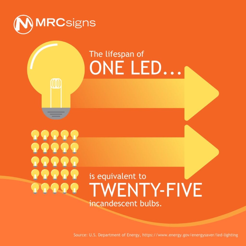
LED, or light-emitting diode, is the bread and butter of modern signage lighting solutions. It is the most energy efficient and cheapest of all of your lighting options. LEDs use 75% less energy than incandescent lighting and last nearly twenty-five times as long, according to the Department of Energy. Additionally, LEDs and LED signage are incredibly versatile. In fact, it’s likely that many of the signs around you that you think are neon are clever LED replicas.
Would you use LED lighting for your business’s sign?
Types of Lighting
Lighting is often categorized in two ways: “lighted” or “lit” signs, which are lit with one of the several types of external light, and “illuminated” signs, which are illuminated from within through a variety of techniques. These terms are sometimes used interchangeably. Be sure to establish what exactly you’re talking about with your sign professionals.
External Signage Lighting
External lighting is a flexible lighting option that can achieve many different effects. Existing signs can have exterior lighting installed, making your signage work overtime to promote your business even at night. Mounting lighting strategically can enhance your signage as well. Lighting can be used to spotlight interesting textures or architectural features on or around your signage. Different colors, luminosity, or amounts of lights can enhance the mood of your signage. For example, the scalloped effect created by having multiple, smaller point lights is very different from the soft gradient effect created by a single linear light.
You have many options when choosing how to light your sign. Some of the most popular and accessible types of external lights include:
Flood lights: Flood lights can light up large signs and the surrounding areas. If you need cost-saving, multifunctional lighting, this may be most effective.
Linear lights: Linear lights are very popular, in part because they provide even, comparatively soft, but still clear lighting.
Spotlights/point lights/bullet lights: there are many names for smaller, more focused lights, but all are versatile and useful. When used singly, they are effective at bringing attention to a feature, be it graphic or architectural. When used in combination, they can light up an entire sign and create unique visual effects.
Internal Signage Lighting
Illuminated signs, or signs which are primarily lit from the inside, are incredibly common for modern businesses. Any design you can dream of can be illuminated, making it pop without sacrificing detail. Illuminated signs can be divided into two subcategories:
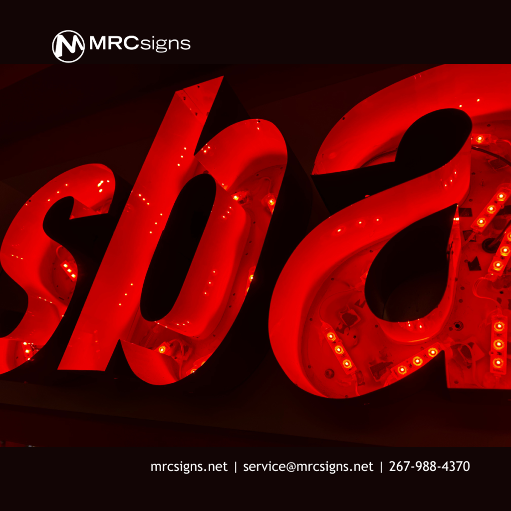
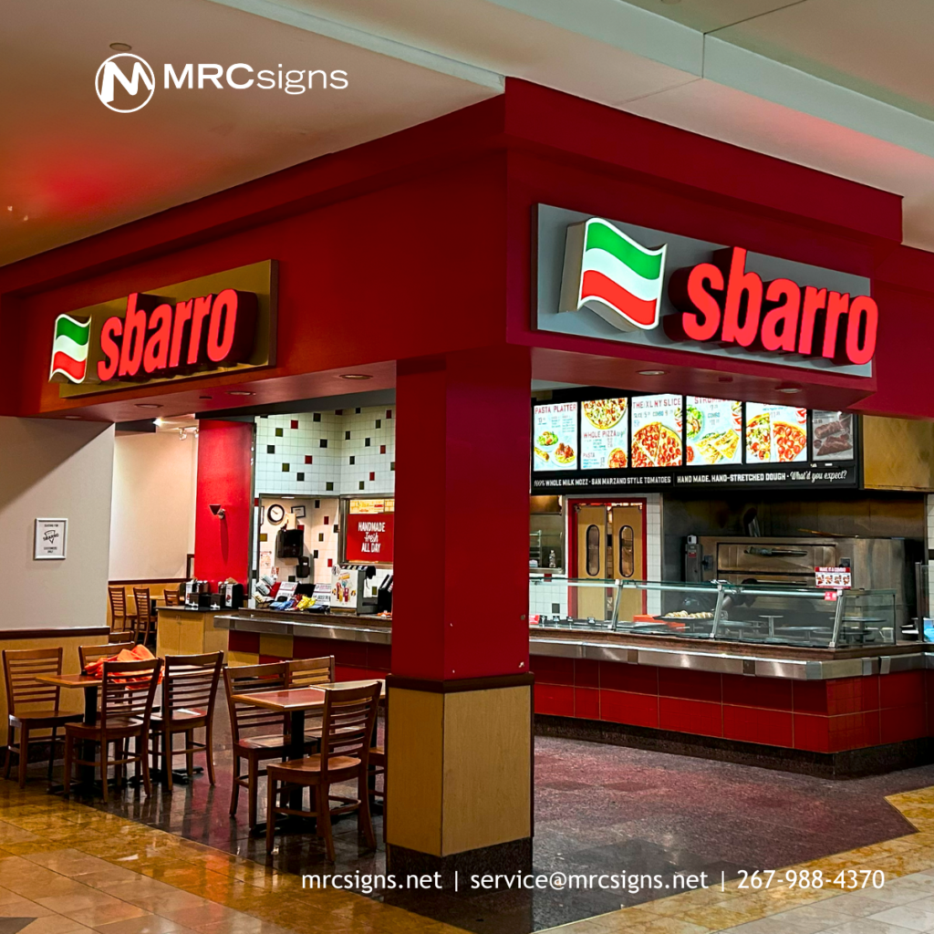
Channel letters: Have you ever seen a business whose name just glowed? That was probably a channel letter sign. These signs can either be face lit, meaning the light within shines out only through the face, or front, of the letter; or backlit, with the light shining out of the back of the letter to create a halo effect. Despite the name, this technique doesn’t just apply to letters. Your logo can pop, too!
LED lights sit inside channel letters.
Channel letter signage makes businesses glow.
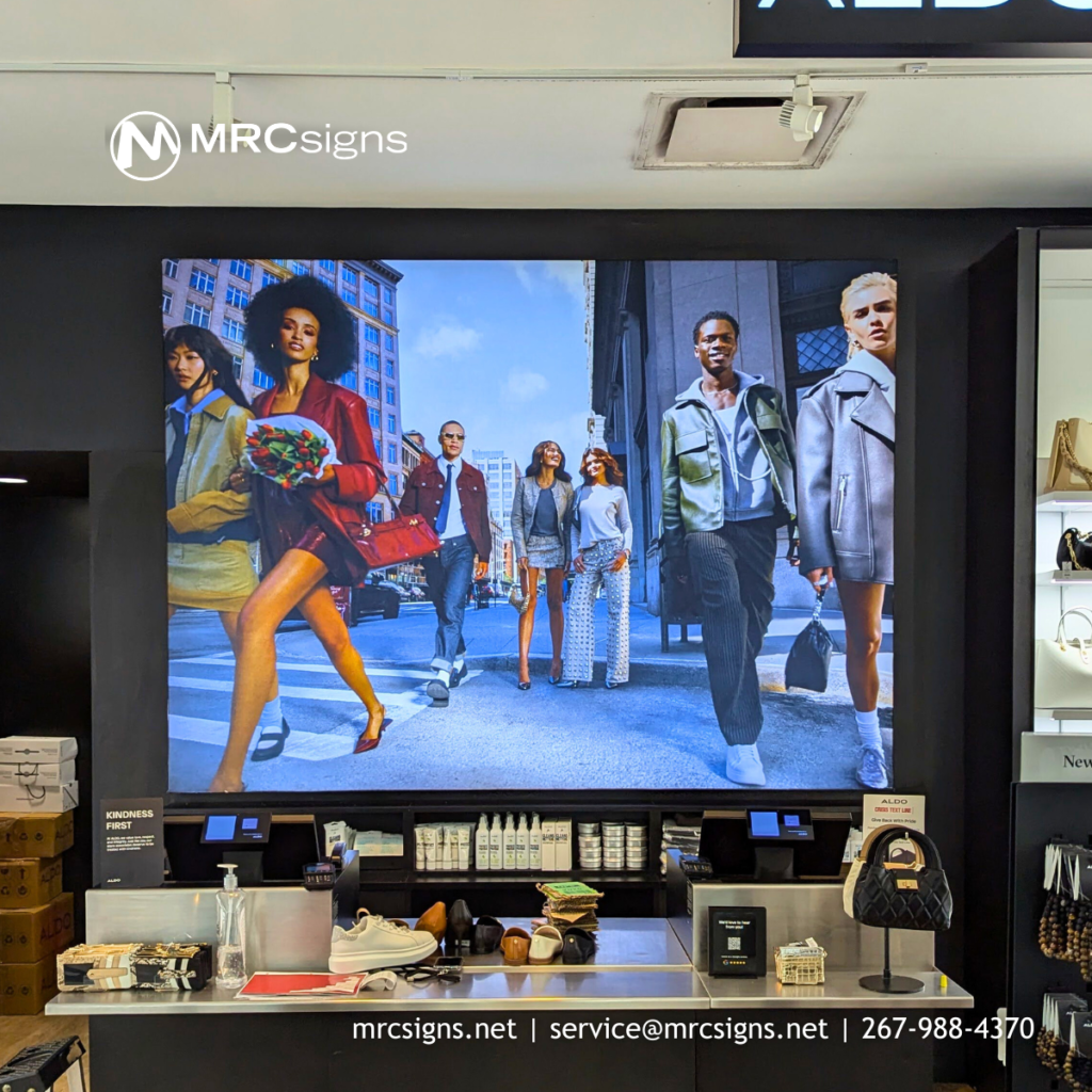
Cabinet signs: These signs are also referred to as “lightbox” signs, because a lightbox sign is a box… with a light in it! In cabinet signs, a frame holds your design(s) with light behind or between, depending on whether both sides of the sign are visible. Cabinet signs are especially useful for detailed designs such as photography.
If you want a useful guide for choosing the best signage for you, we’ve got a cheat sheet to make choosing your signage as easy as M-R-C. Enter your email below to gain access to our signage cheat sheet and other future offers!
Once you’ve finished your cheat sheet and know exactly what type of sign you want, be sure to contact us for a quote for your signage project!
This week, you’re ready to take the next step towards improving your business. You know that signage can improve your business’s brand recognition, increase foot traffic, ensure would-be customers don’t get lost, and even promote deals and sales. You also know that creating your signage can be a complex process, but that we here at MRC Signs are prepared to help you every step of the way. In fact, we’re here now to guide you through your next step: deciding exactly what type of sign you need.
Signs can be as diverse and creative as you and your business are, and they come in many shapes and sizes. We’ve broken them down into three main categories: building-mounted, freestanding, and interior. We’ve also provided a brief description of each. Feel free to skip around!
Building-Mounted Signs
Building-mounted signs are signs that are attached to your building in some way. These signs are key to brand and locational awareness. They can be especially useful when square footage is limited or when multiple businesses are under one roof. To customers, building-mounted signs are most useful on buildings which are visible from the road or when used in combination with other signs that point the way.
Awnings: Awnings extend out from the building, usually over a door. This type of signage has multiple uses. In addition to advertising your brand and maximizing curb appeal, it can also provide potential customers with shelter from the sun and the rain.
Window Signs:Window signs are signs which are attached to, applied on, or hang behind a window. These are usually supposed to be viewed from the outside of the building.
Sign Bands: For buildings with multiple tenants, sign bands run above multiple entrances and display the branding and signage for each business.
Wall Signs: Wall signs are signs which attach to the exterior of a building, usually just below the roof. These signs are also sometimes called fascia signs due to the name of the trim they connect to.
Projecting Signs: Projecting signs are signs which are mounted on the wall of the building and project out, away from the building.
Roof Signs: Roof signs are signs that are mounted on the roof of a business but do not extend above the roof line or change the outline of the building.
Parapet Signs: Parapet signs are mounted on the parapet, a railing or wall along the edge of a roof. They extend upwards past the roof line, changing the building’s outline.
Freestanding Signs
Freestanding signs are signs which are not attached to a building. They are useful for catching the attention of drivers, especially when the entrance of your business is not immediately visible from the street. These signs can be some of the flashiest and most eye-catching, perfect for unique designs and head-turning appeal.
Pylon Signs: Pylon signs are tall signs with visible support structures or poles. Sometimes, however, the poles are covered and incorporated into the design. Pylon signs can also be called “pole signs.” Particularly tall pylon signs are sometimes referred to as “high rise.”
Multi-Tenant Signs: Much like sign bands, multi-tenant signs accommodate buildings with multiple tenants within. Unlike sign bands, these signs are not mounted to the building. These are often found at the entrances to plazas or strip malls and advertise what stores customers can find inside.
Monument Signs: Monument signs are one of the most common types of sign. Monument signs are lower to the ground and have a solid base instead of a pole or other support structure. Often, these types of signs are required by landlords or local ordinances.
Directional Signs: Directional signs point the way to drivers and pedestrians, especially towards hidden entrances. These are often paired with an additional sign or signs which advertise the name and logo of the associated business.
Electronic Message Centers (EMCs): EMCs are signs with digital displays, making it possible for your business to display changing messages, ads, or information. These signs should not be overlooked. Though EMCs can be a large initial investment, they will change with your business and communicate vital info to your customers. Whether you’re rebranding, having a blowout sale, or hosting a huge event, EMCs can keep up.
Vehicle Wraps: Vehicles wrapped with your branding are moving signs for your business. Wrapping your company vehicles expands the reach of your brand far beyond what a typical sign would provide.
Interior Signs
Don’t let interior signage be an afterthought for your business. Interior signs are crucial for navigation and can influence the buying decisions of your customers. In some cases, they are even mandatory. However, they can also add flair and bring your branding into your interior. The sky’s the limit.
Regulatory: Regulatory signs are mandatory signs enforced by local ordinances or laws such as the Americans with Disabilities Act or fire codes. These often denote structures such as elevators, bathrooms, or stairways.
Directory Signs: Like multi-tenant signs, directory signs display information about the businesses present in a building. Often, these also display maps or other locational information. You may have seen these signs in a mall letting you know “you are here.”
Directional Signs: Also known as wayfinding signs, directional signs move your customers through your building and ensure no one gets lost.
Point-of-Purchase Signs: Point-of-purchase signs are signs located within your business. They may advertise sales, deals, or products, and are effective at influencing buyer decisions and increasing sales.
Each type of sign has its own strengths. It can be a real challenge to decide what type will suit your business best. Keep this guide handy on your sign journey, and see our previous post on the how and why of signage, or skip to our posts on sign lighting or sign design and placement.
If you want a useful guide for choosing the best signage for you, we’ve got a cheat sheet to make choosing your signage as easy as M-R-C. Enter your email below to gain access to our signage cheat sheet and other future offers!
Still have questions? No worries, we’ve got you. Get our next installment directly in your inbox by signing up for our newsletter. Or, if you’re ready for the next step, reach out to our team to get a quote.
Trustindex verifies that the original source of the review is Google.
Great Company to deal with . Fair prices and nice Quality Signs. Dale Rimmer Siding
Posted on Google
Philip Fisher
Trustindex verifies that the original source of the review is Google.
Top notch in every respect. Matt is a pleasure to work with. Definitely a five star operation!!
Posted on Google
Michael M
Trustindex verifies that the original source of the review is Google.
MRC exceeded my expectations. Very easy to work with and did a fantastic job.
Posted on Google
Corinna Garis
Trustindex verifies that the original source of the review is Google.
We recently worked with MRC Signs to produce and install new banners throughout Dublin Town Center, in Dublin, PA, in celebration of America’s 250th, and the entire experience was excellent from start to finish. Their pricing was competitive, communication was prompt and professional, and they were incredibly attentive to the details and requests we had throughout the process.
The installation team worked efficiently, the banners look fantastic, and everything was completed with care and precision. We truly appreciated how easy they were to work with and look forward to partnering with them again on future projects. Highly recommend!
Posted on Google
Kyle Messina
Trustindex verifies that the original source of the review is Google.
Experience and professionalism. Owner/operator is a very pleasant guy, easy to talk to and knowledge. If u need branding, this is where u go.
Posted on Google
Vibrant Coffee
Trustindex verifies that the original source of the review is Google.
Great experience every step of the way getting a large exterior sign designed and installed. Highly recommend!
Posted on Google
Deborah Shepherd
Trustindex verifies that the original source of the review is Google.
I am very happy with the quality of the signs that we had MRC signs make for us. The monument front sign, the above the door lit sign, the logo and lettering inside the building, the door graphics, the mission statement sign, etc. are all awesome and I am very happy with them. Look up MRC Signs if you need to promote your location/business. They do a great job. They want to make sure that their clients are completely happy and the go above and beyond to accomplish this task.