Sign Graphics: How to Get a High Quality Print
It’s every business owner’s nightmare scenario: you know your business needs a sign. You’ve created the perfect sign design. But when you see the final product, the colors are all wrong, and your sign’s graphics are pixelated, blurry, or both. What happened?
Preparing your graphics for printing, especially large-scale printing such as sign graphics, can require a lot of knowledge and familiarity with graphic design and file specs. MRCsigns’ graphic design and printing prep team is ready to help you prepare your sign’s graphics for printing, but if you’re prepping files yourself, here’s what you should know before sending any file to print.
Raster vs. Vector Sign Graphics
Your sign’s graphics can be rendered as either raster or vector. In raster images, hundreds of thousands of tiny dots of color–pixels–are placed on a grid to create your image. Vector images, however, rely on mathematical formulas to calculate the shapes and lines that make up your graphics. Because the placement of the pixels is determined by formulas, your sign’s graphics can be made any size and still look sharp. If you are making your image larger, the formulas will determine where to place new pixels. If you are making it smaller, the formulas will determine where to remove them. With raster graphics, however, the existing pixels either compress or stretch. This means the jagged, pixelated edges become more obvious as your sign’s graphics are scaled up. For this reason, it’s best if the graphics you intend for your sign are in vector format from the start.
Certain programs are specifically designed for vectors. When creating your sign graphics, consider working in Adobe Illustrator, CorelDraw, or Inkscape instead of Adobe Photoshop, Canva, or Microsoft Paint.
File Types
The file type you use for your sign’s graphics can also play a part in the pixelation and blurriness of your sign. Certain types of files do not hold vector graphics, only raster; others are the opposite. Some can even hold both.
Some of the types of file that can hold vector images are .pdfs, .ai, .svg and .eps. File types that hold raster include .jpg, .bmp, .gif, .png, and .tif. However, just because a file type can hold a vector image doesn’t mean it does. Make sure that when you are creating the graphics for your sign, you’re using vector tools from the start, not just converting to an .ai file at the end and expecting your graphic to suddenly become a vector.
DPI and PPI
Vector graphics are usually preferable for signage. Raster images, however, do have their uses. For example, you may want to include photography in your signage. Photos are far too complicated to be stored as vector images. Instead, the ideal form for photography is a high-resolution raster image. Resolution of images meant for screens is referred to as “PPI,” or pixels per inch. When printing, resolution is measured in DPI, or dots per inch. This refers to the literal amount of dots of colored ink the printer is told to add per every inch of your design.
Many factors influence the ideal DPI of your sign graphics. If a sign is very large and intended to be viewed at a distance, lower DPI may be acceptable. After all, the human eye can only capture so much detail from fifty feet away. However, don’t make an assumption that your low res photo is a-okay. Higher res is always easier to work with, because making an image smaller is easier than making it larger.
Smaller signs meant to be viewed further away should be printed at 300 DPI. In fact, 300 DPI is a good rule of thumb when working with any file meant to be printed.
Design to Scale
Before you design the graphics for your sign, you should know how large your sign is going to be. When you create your file, be sure your canvas or artboard fits the dimensions of your future sign. This can help avoid any nasty, pixelated surprises when you go to get your sign graphics printed.
Some sign’s dimensions may exceed the limits of your vector program’s artboard or canvas sizes. In this case, many printers recommend you create your graphics at a smaller scale. Try 75%, 50%, or 25%–but not lower, as past this size, you may once again begin to encounter issues with quality.
Raster based image programs also have size limits. Changing your canvas size still works, but you have to increase your DPI accordingly. For example, you can reduce your file size from 8’ x 10’ to 4’ x 5’, a reduction of 50%, but you would need to increase the DPI by 50%, too; for example, from 300 DPI to 450 DPI.
If your graphics were created at a small size or low resolution, it can be nearly impossible to scale them up to the size of a sign after the fact. Sometimes, the only way forward is to remake the entire design. Start with a large, high resolution file so your hard work and graphics aren’t wasted.
CMYK vs RGB
You may have heard the acronyms “CMYK” or “RGB.” These describe the way various devices interpret the colors in your graphics, referred to as color profiles.
Most files on the internet are in RGB, as they are optimized for screens. Screens display color through light. If you’ve ever shone a light through a prism and seen a rainbow come out the other side, you know white light is actually a combination of all colors of light. Screens work by displaying varying amounts of red (R), green (G), and blue (B) light. High amounts of red, green, and blue light mix to create white. Low amounts create black.
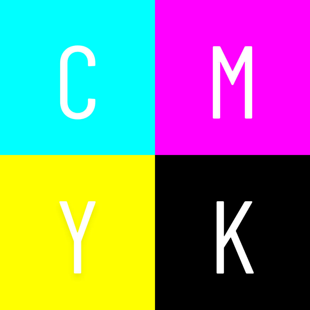
Print files, on the other hand, use CMYK. Ink shows color in the opposite way light does; combining three standard ink colors; cyan (C), magenta (M), yellow (Y); creates black (K). Adding no ink leaves white.
RGB color profiles can be converted to CMYK color profiles, but the conversion process isn’t one to one. While not a sign-destroying error, the colors of your sign’s graphics may not come out exactly like you imagined. The options to change color profiles are available when you create a new file in your program of choice. If you plan to print, be sure your sign graphics are in CMYK from the start, not RGB.

Trust the Sign Graphics Pros
These basic tips should help you optimize your sign graphics for printing. However, every sign project is unique, and not everything can be accounted for in a basic guide. Some things can only be learned through years of experience, and some techniques are specific to the signage industry. That’s where MRCsigns’ design team steps in. Our team preps your sign designs and graphics for print. We also install and maintain your signage. Reach out to our sign designers today to get a quote for your signage design, printing, and installation!
If you want to stay in the loop with more signage tips and what MRCsigns has to offer, sign up for our biweekly newsletter or connect with us on social media.